Start a decorating palette with the things you are keeping. Your floor, sofa and wooden furniture already bring colors into the room; new textiles need to work alongside them. A few physical samples will tell you more than names such as cream or beige on a screen.
Gather a few actual samples: a pillow cover, a napkin, a fabric scrap and a piece of plain paper for notes. You will compare them beside the floor, furniture and walls instead of trying to remember those colors while you shop.
Start Your Home Decor Color Palette With the Keepers
List the large pieces that will stay: flooring, sofa, cabinets, dining table and any rug you love. Write a simple description of each, such as honey-colored wood, gray upholstery or cream walls. Include a patterned piece if it occupies a large part of the room.
Choose one of those pieces as your starting point. A rug with several colors can offer an accent you already know belongs in the room. A plain sofa may lead you toward its fabric's warmth or coolness, with the table or flooring contributing another color.
Photograph the room for reference, but keep the physical sample nearby when making the final choice. Lighting and screens can change how colors appear. A photo is useful for remembering the arrangement; the actual fabric settles a close comparison.
Compare Similar Colors Side by Side
Compare two light-neutral samples side by side. Cream may look different beside a pinkish beige than beside a pale gray. Move the samples onto the sofa and then near the floor so you can see the relationship in both places.
Try a larger piece of fabric when a tiny swatch is hard to judge. A folded napkin or a pillow cover shows more of the color than a thumbnail on a screen. Keep the surfaces adjacent for the test, even if they will eventually sit across the room.
Write down the combination you prefer in plain words. “This softer cream works with the sofa” is more useful to you than an elaborate color name you might not recognize later. Keep the rejected sample nearby until you are sure why the other one works.
Give the Colors Different Jobs
Choose a background, a supporting color and a smaller accent. The background is already supplied in part by your walls, floor and largest furniture. The supporting color might appear in curtains, a runner or two pillow covers. The accent can live in a much smaller area.
You do not need to buy equal amounts of each color. A dark plum cushion may have more presence than several pale linen pieces. Judge the balance from the doorway.
Keep one color repeated in separate parts of the space. A green detail in a pillow can connect to a green stripe on the dining runner. The pieces can have different patterns and still share that small thread of color.
Try a Warm-Wood Room
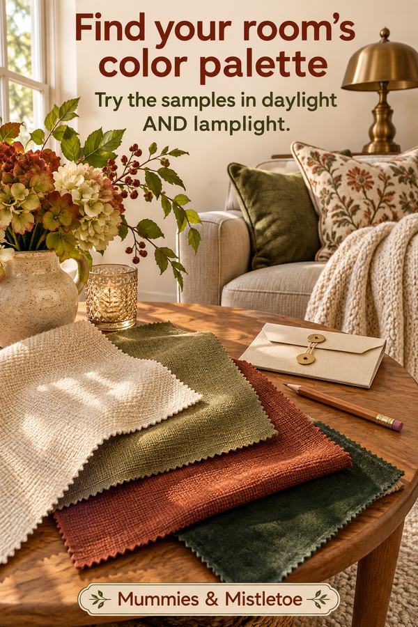
Imagine a room with honey-colored flooring, an oatmeal sofa and a brown wooden table. Start by placing cream fabric beside the sofa, then try a muted olive sample and a small rust-colored one. Include the wood tones in that palette.
Test olive on the larger textile first, such as a cushion or folded throw. Let rust occupy a smaller spot, perhaps a napkin on the nearby dining table. If the room begins to feel too orange, remove the rust and compare a deeper green in its place.
For a patterned runner, look for one that includes the cream or olive you have already tested. Set a plate on it during the comparison. You are choosing a textile that belongs with the things used in the room, not just a pleasing sample on its own.
Try a Gray-and-White Room
For a gray sofa, white walls and a dark table, start with a pale blue-green sample and one warmer neutral. Compare an ivory textile with a light stone-colored one against the sofa. One may give you the softness you want without looking like an accidental mismatch.
Try the blue-green in two places, such as one cushion and a small table textile. Keep the dark table visible as the strongest contrast. If everything begins to look washed out, test a deeper version of the same accent instead of introducing several new colors.
Compare those combinations with the gray fabric, wood finish and light in your own room. Use the sample that works in front of you, even when its name differs from the color you expected to choose.
Check Daylight and Evening Light
Leave your favorite samples in position through the part of the day when you use the room. Look at them in daylight, then with the lamps you normally turn on. A combination chosen only beside a sunny window may feel different at dinner.
Move the samples to their intended locations as well. A pillow on a shaded sofa and a runner beside a bright window receive different light. You may prefer a slightly deeper accent in one place while keeping the same general color family.
Make one change at a time. Replace the cream sample, or change the accent's depth, then look again. Changing every sample together makes it harder to tell which choice improved the room.
Take a Small Palette Kit Shopping
Put the successful swatches in an envelope with measurements and a photograph of the room. Add a note about which item you are replacing. That keeps a lovely but unrelated fabric from becoming the start of another whole decorating plan.
When comparing a printed pillow or runner, look first for one connection to the kit. Then check the pattern's scale and how much of the accent it uses. A matching color does not require a matching print.
Place the chosen textile in the room before adding anything else. Walk to the doorway and look at the colors together, with the table, floor and sofa still doing their part.
For an autumn table, our Thanksgiving section offers seasonal textiles you can compare with your palette kit. Start with a runner or cloth that repeats one color you already enjoy, rather than rebuilding the whole room around a new print.