The pink cushion looked rosy in the shop photo, but against your sofa it looks like a slice of peach. Pink Valentine's decor can be surprisingly fussy about its neighbors. Before you replace it, try the color beside your upholstery in daylight and lamplight; sometimes the problem is the pink, and sometimes it's everything crowded around it.
This is a small color test you can do with paper and fabric before buying another cushion or painting anything. You'll finish with a pink that works against the furniture you see and use every day.
Compare Three Pinks Against Your Sofa
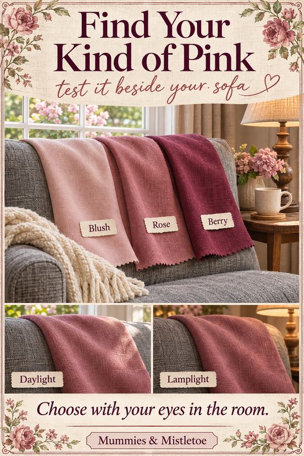
Gather three pinks: a pale blush, a muted rose and a deeper berry. Paint chips, scraps of fabric and colored paper are useful starting points. Set them directly against the sofa back, where they share the same light as a cushion.
Use pieces large enough to see from your usual seat. If you only have tiny chips, group several similar ones on separate sheets of plain paper. Label the backs so you can remember which was which, then remove the paper borders when comparing the colors against the furniture.
Look at the samples with the curtains open and again under the lamp you use at night. Take a photograph to compare arrangements, but make the final choice with your eyes in the room. A phone can change the warmth and brightness of a color.
Find the Gray Hiding in Your Gray Sofa
Gray upholstery may lean blue, green, brown or purple. You don't need to name it perfectly. Hold plain white paper beside the fabric and notice what becomes more obvious, then compare the pink samples one at a time.
For a blue-gray sofa, begin with rose rather than orange-pink. For a brownish gray, compare a muted warm pink with the rose. If the upholstery already looks slightly purple, test a pink that doesn't add more lavender unless you want that effect.
Before: a peach cushion on a cool gray sofa, with a bright white throw making the difference sharper. After: a rose sample in the cushion's place and a softer cream throw folded beside it. If the original peach now works with the cream, keep the cushion and change only its neighbor. If it still looks orange to you, the rose is worth testing in fabric.
Keep Pink Visible Against Brown Furniture
Brown leather and dark wood can make a pale pink look beige, especially under warm lamps. Put your blush sample directly against the brown, then try the deeper rose in the same spot. The question is whether you can still recognize the pink from the doorway.
Before: a pale blush cushion on brown leather, with an oatmeal throw covering most of it. After: the same cushion brought forward, with a cream throw behind one edge instead of draped over its face. Exposing more of the pink may solve the problem without a new purchase.
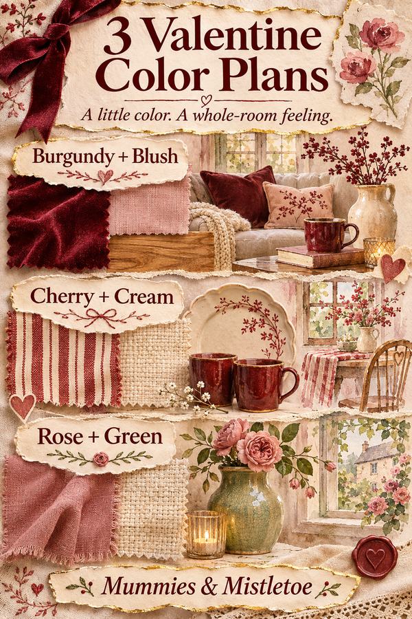
If it still disappears, try a stronger dusty rose. Keep a small burgundy ribbon or paper heart nearby while testing, but take it away for the first comparison. A large dark red patch can make a quieter pink seem washed out before you've given it a fair look.
Separate Blush From Cream Upholstery
Cream furniture and pale pink can be so close in lightness that the cushion barely registers. First check whether the combination looks intentionally soft or simply indistinct. Look at it from the place where guests enter, not only while standing over it.
Before: a very pale pink cushion, cream sofa and cream throw all pressed together. After: the throw moved to the other end, leaving the pink's outline visible. If that isn't enough, try a mid-tone rose or a pink pattern with a little darker detail.
Don't make the entire corner brighter just to rescue one disappearing object. A deeper cushion can do the job while the furniture, walls and curtains stay exactly as they are. If you prefer pale blush, use it on the darker side table instead, where a pink card or small arrangement has a different background.
Correct One Problem at a Time
Set up your favorite combination, then change only one thing between checks. Otherwise you won't know whether the improvement came from the cushion, the throw or the lamp.
Too orange: compare the pink with a less peach-colored sample, and remove nearby orange accessories while testing. Too purple: try a warmer pink, especially if the sofa already leans lavender. Too loud: reduce the area of bright pink before deciding the shade is wrong. A small ribbon can carry a color that overwhelms an entire cushion.
Flat only at night: bring the sample into the light of the existing reading lamp. If the color returns, placement may be the issue. If every sample changes unpleasantly under that lamp, choose the one you enjoy in the light you use most; daylight isn't the only setting the room needs to suit.
Take the Winning Sample Shopping
Keep the chosen sample with you when considering a cushion cover, and check the seller's fabric photographs as well as the styled room pictures. A shiny material reflects light differently from matte fabric. The same named shade can also vary between makers, so the name alone won't settle it.
Leave your best sample against the sofa for an evening before ordering. Note which throw and lighting made it work, then keep that sample with your room measurements. You'll have a useful reference for the next cushion cover instead of having to start the color test again.
Keep your successful pink sample when you browse Mummies & Mistletoe for another seasonal accent. Comparing artwork with the colors you already tested is more useful than starting a new palette with every holiday.